It’s her big moment. The management trainee has been given the chance to present the results of her project. The polite audience is quietly attentive. “I’m here to talk to you about the XYZ results” she announces enthusiastically.
‘Whoosh!’ goes the effect as the presentation begins and the first text box blows in. ‘Boing’ rings the second effect as the next slide transitions onto the screen, spinning dizzily. ‘P’chew’ ricochets the third effect as another text box flies into view…
And so it goes on. Effect after effect, peppered with emoticons and stick figure clip art. Audience agitation turns to irritation. The message is slowly overshadowed by the delivery. It becomes lost inthe Powerpoint or ‘App with too many effects’ land.
Welcome to Presentation Skills 4. It was originally written in July 2018 so some of the details might no longer be so current, however the basic principles remain the same. In the last blog we looked at formats and layouts. In this blog I want to talk about simplicity, consistency and the over use of effects.
Let’s begin with a very simple idea. The most important thing in your presentation is the message (obviously). How can you deliver that message clearly, succinctly and free from distractions so that you maximise the retention of information and key take away points, for your audience?
To quote Antoine de St Exupery – “Perfection is achieved not when there is nothing more to add, but when there is nothing more to take away…”

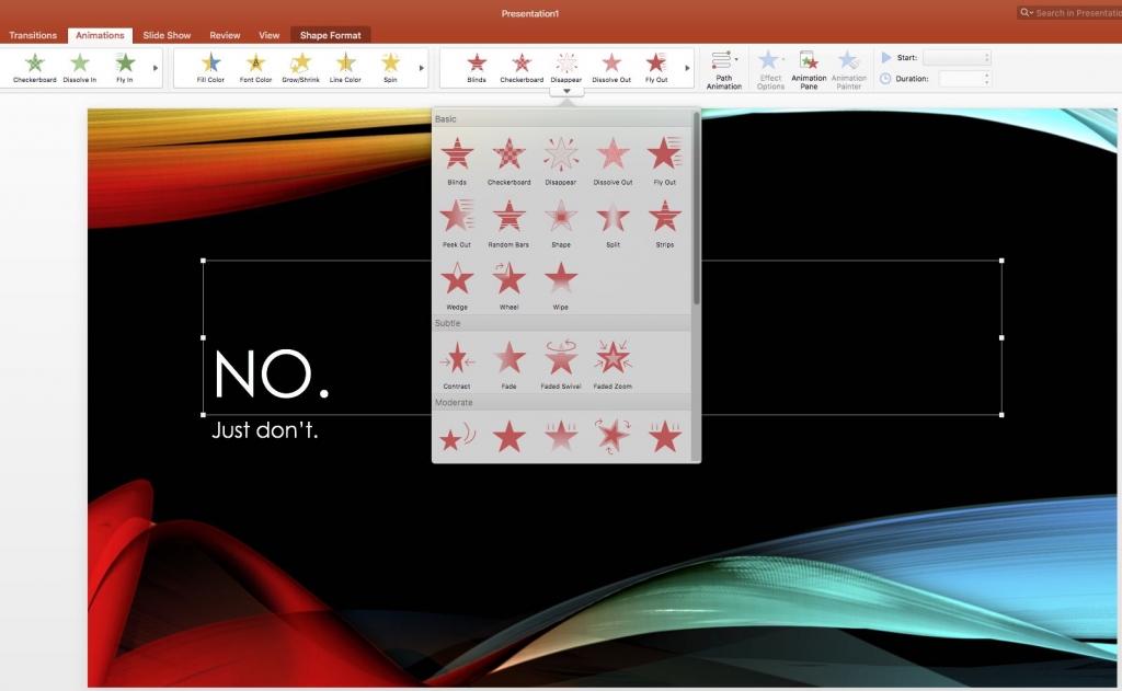
Don’t use every effect in the Powerpoint tool box
Your focus should be on what you are saying, your key messages, not the way in which you are presenting them.
Try to keep your presentation simple and un cluttered, and use consistent understated formats for its delivery. You don’t have to use every tool in the Powerpoint or software effects box to grab peoples attention or make a point.
This is often the problem with presentations put together by people who are just starting out with Powerpoint. As we see the current boom in new presentation App’s, the problem is no different, in fact it is more complex…
Personally, if I have to use PPT, which has undoubtedly become an amazing tool, I choose one understated style of transition for slides that announce a change of topic, and another low key transition style for changing all the slides within that particular topic. My preference is to stick with this principle for the entire presentation.
I rarely use animations other than fade in or fade out for the arrival or highlight of text. This keeps the audience focussed on what you are saying rather than being distracted by what they are looking at on screen. In this case, less really is more.
Let’s talk about Fonts; Again, I prefer to use the same font, in the same size, for all the main text content of the presentation. Then use the same font for headings but in a larger size, with bold if you must. I like to use Calibri or Ariel as they are simple and easy to read.
Don’t be tempted to write in CAPS LOCK and leave fancy fonts for 21st birthday invitations.

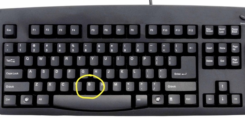
Press the ‘B’ key in Powerpoint to turn the screen blank
Now here’s a useful presentation tip: when using Powerpoint 2013 or above there is a handy little function you can activate by hitting the letter B on the keyboard. It turns the screen blank. This is really useful if you want to gain the attention of your audience. It can also serve to create a pause or interval when changing topics.
I use Keynote for Mac and build black slides into my presentations to achieve the same outcome, so I can focus on key messages.

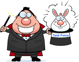
Leave the rabbit to the real magician
Another tip: try not to use Cartoons and Emoticons, unless you are addressing children…. Cartoonish.gif files aren’t much better either. Jokes aside, there may be a time and a place for these but your serious presentation might not be one of them.
Clip art was created back in the early days of Microsoft products when digital media didn’t really exist and static two dimensional cartoons were a craze. School projects and 1st year college assignments are the natural home of these images. Aside from the odd symbol or wingdings character, in my view cartoon clip art has no place in any professional presentation as there are so many better alternatives to consider.
Here is one final consideration; review the length of your presentation. Don’t over work it.

Can you avoid 90 minutes of sleep inducing prattle?
I attended a hospitality forum in Guangzhou a few years ago and one of the guest speakers stood at the lectern and spoke without a break for 1 & 1/2 hours. In the end there were far fewer people left in the room than when he started. He completely destroyed the delivery.
How long is too long? Start by thinking about the key points and then elaborate to make sure the message is understood. It might only need to take 20 minutes. 45 minutes is a good rule of thumb for the maximum time you should try to engage with your audience in one go. There is a reason why most schools have 45 minute classes (or less).
That is of course unless you have used variety, breaks and intervals to change the pace and tone of your presentation. More about that next time.
In my final presentation skills blog we will touch on music, guest presenters and crazy drum shows. How to package an entertaining presentation.


