You are sitting in the audience and the presenter has just put up yet another slide so full of text and graphics that it reminds you of the Kaleidoscope your grandfather showed to you as a child; pretty, ever changing colours and patterns but no chance of discerning anything meaningful, let alone the words hidden amongst the mass due to the use of a 9 point Gil Sans font.

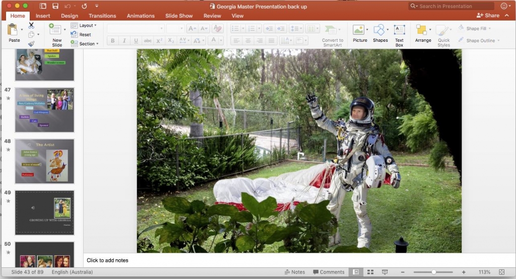
Don’t let anyone present in slide view mode…
Welcome to presentation skills 3. If you have been following the series, thanks for your interest! If not, this is the third instalment which has a few tips on simplifying formats, material and contents.
In this edition I’m going to refer specifically to Microsoft Powerpoint. There are many other options and some great mobile apps, but I’m focusing on good old PPT as it tends to dominate the office environment.
Some of the concepts here might be very simple, but remember this is for everyday office folk, not highly paid presenters who should know better anyway.
To kick off, a good friend and fellow GM once told me how he sat through a presentation made by a fairly senior executive, whilst the whole thing was delivered in side-bar slide-view mode. It may have been generational, lack of experience, politeness on the part of the facilitator or a combination of all three. However the thing that is so memorable was not the content or the message, but the fault in the way it was delivered. If you think it doesn’t happen in your organisation, think again, as I have certainly witnessed this spectacle in mine…
Moving on. The slides are up (without sidebar we hope) but… the content mass is overwhelming.
“Death by powerpoint…” has become a cliche and for good reason. Interminable speeches with too much information per slide, too many of the same type of slides, so many different topics in one presentation. It may be a cliche but it holds true.
The basic rule of thumb is that if you want to get your message across, you should reduce the visual content and crystallise or summarise the message. Present it to your target audience in manageable bits.

Do not distort your photography

Wide landscape format on a black background
Personally, I only use one, or a maximum of two images per slide, including photos or graphics. Place them correctly, that is centred or balanced, and use white space for even spacing.
Even better, use a black slide background to separate them. Putting photos on a black background removes the screen glare and accentuates the image to give a more professional edge.
Don’t try to pack photos or graphics side by side like sardines, but frame them so they are clearly distinguishable. This is a common fault especially with inexperienced users. You could also use animation fades controlled by a hand held device, or an assistant if you are lucky to have one, to overlay them one by one as you speak.
Importantly, when it comes to photos, make sure they are scaled properly. Don’t be tempted to distort or stretch them to fit on your slide layout, keep their original proportions and set them on a neutral background. Especially with people. Show some respect… My favourite photo fault occurs when presenters inadvertently distort photos that contain people, the result being they are either squat and fat or too tall and thin, with elongated faces…

Don’t squash or stretch images of people…
Here is another point to consider.
Do not read straight from the mass of text on your slides, (you shouldn’t have a mass of text on your slides anyway…) and certainly don’t turn your back on the audience.
I’m sure at some time you have witnessed the scene where the presenter, back to the audience, laser pointer in hand, laboriously reads through the 400 or so words that make up the solid paragraph of text you can see on the screen. You are asking yourself why you bothered to attend when they could have simply emailed you the text instead. As a presenter, try to simplify and summarise the ideas being presented on the screen and talk about them. We’ll discuss that more in the next blog.
By now you are coming to understand that it is important to reduce the density or intensity of the visuals. The header photo of this article is a classic example of what not to do. There is just way too much information in that slide. It could easily be broken up into six individual slides, and discussed one by one. But instead, as you can see, there is so much content in the slide that the audience would be prone to gazing over the graphics instead of listening to the discussion point that you are trying to make.
And finally, last point of the day, if you are using a corporate template or a theme with borders, Please, Please, Please make sure the material is actually contained within the frame of the template. Honestly, I can’t tell you how many times I have seen slides with an image or text bleeding content over the edges of a corporate template, concealing the efforts of the poor guy/girl in graphic design who went to great lengths to make it presentable as a template. Brand integrity? No. Not only does it look unprofessional, it suggests a lack of care in preparation. After all, you want to be taken seriously, right?
In the previous three blogs we have looked at presentation fundamentals. In presentation skills 4 we will look at the over use of effects, otherwise known as avoiding dizziness and pulling rabbits out of hats…


